Back to home

← Back to home

Mintics Mobile App

Optimizing NFT Minting And Trading For Efficiency

Optimizing NFT Minting And Trading For Efficiency

Optimizing NFT Minting And Trading For Efficiency

Lead Product Designer

Lead Product Designer

Role

Role

Web3.0

Web3.0

Industry

Industry

Mobile iOS & Android

Mobile iOS & Android

Platform

Platform

Background

When an NFT project is released, a lot of people want to buy (mint) it, especially when it is popular and highly anticipated. This makes it hard for people with average internet or who are new to buying NFTs to get one because so many people are trying to buy the NFT at the same time, and the project can sell out very quickly. So how might we aid NFT traders in being able to participate in NFT project mints and not miss out on opportunities?

I’ll walk you through how I spearheaded a design solution for this problem in this case study.

Process

Although I was the sole designer of this project, I didn’t work alone, it was a strong team effort that included three skilled developers. We communicated and brainstormed throughout the entire process.

I began by analyzing three similar automated minting apps (Tokun, Fenix, and NFT Thunder) and discovered that none of them is supported for mobile devices. We considered changing our focus and decided to solve this problem with a mobile app, instead of our original plan to target desktop users but we needed to validate this.

Research

Qualitative Research - User Interview
I conducted 5 user interviews with existing users of Tokun, NFT thunder and Fenix.I asked open-ended questions that got the users to explain the pain points that they experience using these desktop minting apps.


Quantitative Research - Survey
I created a survey using close-ended questions to understand the pain point users experience and at what frequency they experience those pain points. I created the survey using Google forms and shared it across various NFT Discord & Reddit communities. I got a total response of 40 after 4 days of sharing.


Below are the result of both research methods:

User Personas

These personas were created based on users I have met, and I put them together to serve as a reminder to focus on addressing their pain points every step of the way.

These personas were created based on users I have met, and I put them together to serve as a reminder to focus on addressing their pain points every step of the way.

Problem Statement and

Proposed Solution

Problem: Following the qualitative and quantitative research conducted, I was able to gather that the ease at which users can set up and manage wallets to prepare for mints is a significant criterion they look out for in minting apps. Also, a major problem is complexity when setting up the mint task because a lot of blockchain parameters will be required and often times it gets confusing.


Solution: I believe the way to solve this user problem is to create a mobile app that can process mint transactions in the shortest timeframe for Lin and also presents the lowest level of complexity and difficulty for Ezra, especially in the aspect of wallet management and setting up the mint process.

Design

I spent a significant amount of time thinking of different ways to approach this in order to achieve a shallow learning curve with the whole app. I decided to focus on hierarchy, using friendly language (because NFT terms can be confusing to newbies) and making sure the user understands what is going on at every step of the way.

I spent a significant amount of time thinking of different ways to approach this in order to achieve a shallow learning curve with the whole app. I decided to focus on hierarchy, using friendly language (because NFT terms can be confusing to newbies) and making sure the user understands what is going on at every step of the way.

Userflow

I created a user flow to illustrate how a user would navigate setting up their wallets and minting an NFT.

Wireframing

I made simple wireframes speed up the decision making process and keep the design direction clear. These wireframes were based on the main problems we needed to solve.

I made simple wireframes speed up the decision making process and keep the design direction clear. These wireframes were based on the main problems we needed to solve.

High Fidelity

(1st Iteration)

In my initial high fidelity iteration, we have a Home screen that shows the user an overview of their current projects, their NFTs and market gas prices, then Wallets management which allows users to create, fund and manage as many wallets as possible, And lastly the Projects screen where the user can create new tasks or edit current tasks

In my initial high fidelity iteration, we have a Home screen that shows the user an overview of their current projects, their NFTs and market gas prices, then Wallets management which allows users to create, fund and manage as many wallets as possible, And lastly the Projects screen where the user can create new tasks or edit current tasks

Testing Rounds

I prototyped the screens after designing and had a live testing session with 5 users over Zoom. Majorly what I was looking for from the testing was to discover if the designs are friendly enough and reflect what we are trying to solve. I asked the users to do the following:

  • Sign into the app

  • Setup wallets for minting

  • Setup parameters for the NFT project they want to mint and approve

Based on their feedback, I continually iterated my design with a more user-friendly approach which resulted in certain improvements, see them below.

2nd Iteration Results

1. More optimized Homescreen:

I prototyped the screens after designing and had a live testing session with 5 users over Zoom. Majorly what I was looking for from the testing was to discover if the designs are friendly enough and reflect what we are trying to solve. I asked the users to do the following:

  • Sign into the app

  • Setup wallets for minting

  • Setup parameters for the NFT project they want to mint and approve

Based on their feedback, I continually iterated my design with a more user-friendly approach which resulted in certain improvements, see them below.

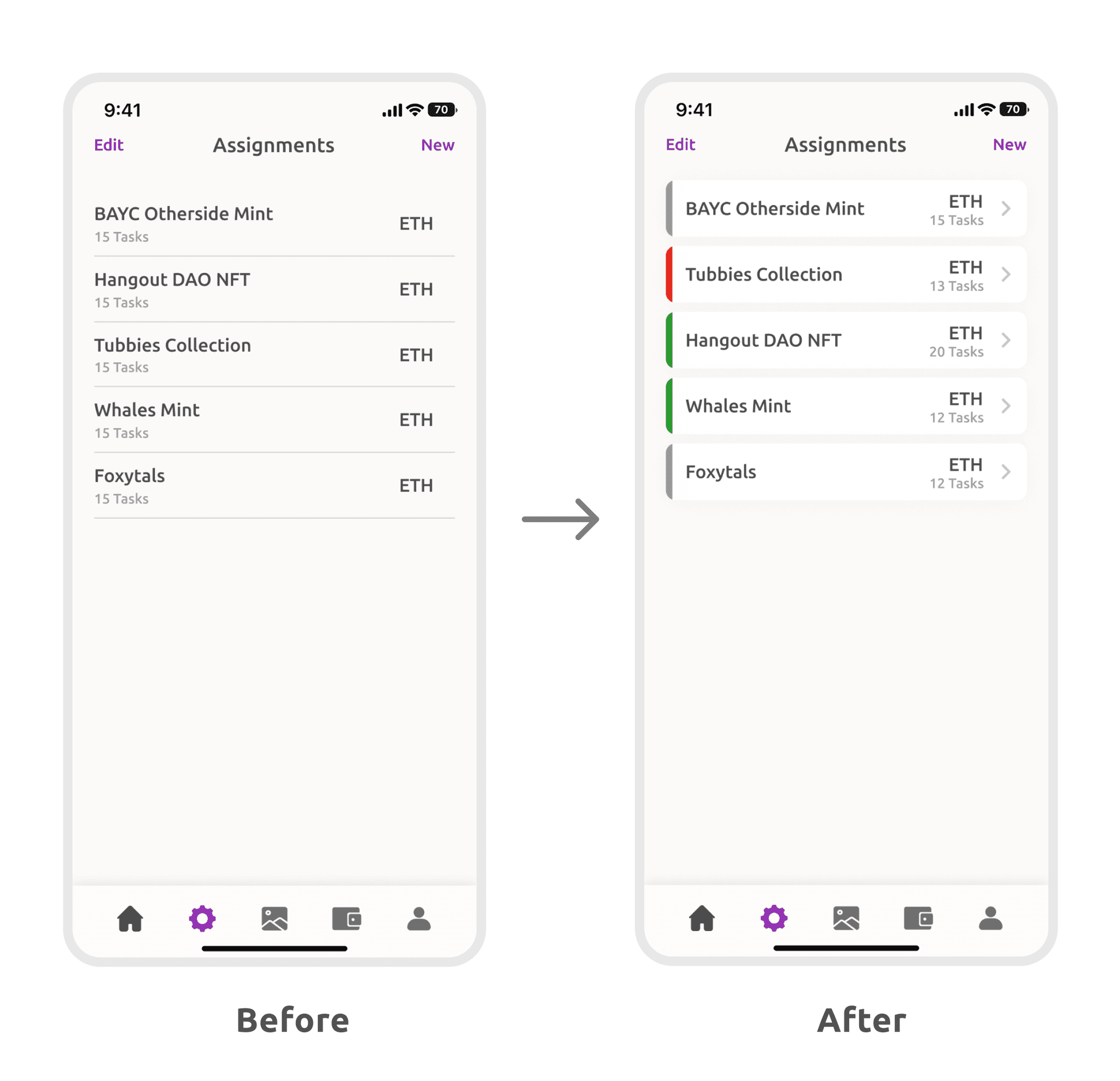
2. Added project status indicator:

Added a colour-based indicator to each project card to show the status - Red meaning error, Green meaning Active and Grey meaning Idle

3. Simplified wallets page

Based on user feedback that the initial screen was not too appealing to the eye visually, I tried to simplify the design and removed the big button in order to make it less colour heavy.

  • Changed Distribute to Manage because users could not initially tell what the button does. Also added headers where relevant to break each element group so it is easier for users to understand

3rd Iteration Results (Final)

1. Better hierarchy & Language:

  • Based on mentor feedback, I moved the projects list to the top of the screen to give it higher priority over other elements. I thought this was a smart suggestion because the projects rank higher than Gas fees info in terms of importance to the user.

  • Simplified the Projects & Gas Analytics section and removed colours on the headers, per user feedback that there were too many colours on the screen. I found that made this made it more digestible and less overwhelming.

  • Revised the header language to make them easier to understand and added more detailed information to the projects list which I will go through in more detail next.

2. Detailed project list:

  • Based on user feedback, the colour indicators on the side of each task card to show the task status were not too easy to understand. I improved the design to show the project status and task status in more detail using text, icons and colours allowing the user to view all of this information at a single glance.

  • For situations where there are only a few failed tasks while other tasks in the project are running fine, the user attention can be called to that without having to mark the entire project as an error.

3. Simplified project creation process:

  • Based on user feedback, filling in required smart contract parameters on one screen was better than breaking the process into bits, they preferred doing it at once rather than having to click on ‘next’ to fill another section before finalizing

  • "Initially split process to reduce clutter and overload, but most users wanted to edit errors and double-check parameters without navigating two screens. Some just wanted to create a project in one click and as a result, I narrowed it down to one screen.

Key Takeaways

  1. Constant iterations either small tweaks or significant changes based on user feedback was very key in the evolution of the design from wireframe to final version.

  2. Prioritize insights and feedback from users: Users are the ones who will ultimately be using the product, so it's important to prioritize their thoughts and put them first.

  3. It is fine to make assumptions about what users want or need, but it is important to validate those assumptions and how they align with business objectives.

+1 (682) 325-8032